top of page
Revintage TO
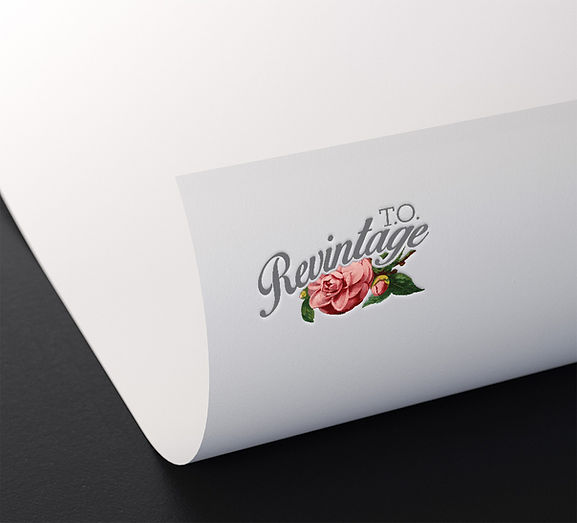
Revintage T.O. gives forgotten objects a second life through thoughtful restoration and sustainable design. The identity centres on a custom script logotype inspired by an antique letterpress, paired with a vintage rose illustration — an emblem of renewal and a quiet metaphor for the items themselves blooming again.
A palette of charcoal, blush pink, and botanical green keeps the look nostalgic without feeling dated, carried through to a business card designed as a tactile first impression. The project was ultimately an exercise in storytelling: building a visual language that shifts how people see value in the overlooked and the old.


bottom of page